Learn how to draw a great looking Chicago Bulls Logo with easy, step-by-step drawing instructions, and video tutorial. You can now easily create a beautiful Chicago Bulls Logo drawing.
Complete Chicago Bulls Logo drawing
Jump to the step-by-step instructions.
Are you a Chicago Bulls fan? Do you share your love for the team by wearing the team logo on a jersey or sweatshirt or displaying it on a flag, notebook, or vehicle? You can learn how to draw a Chicago Bulls logo on whatever you'd like.
The Chicago Bulls are an American professional basketball team and part of the National Basketball Association, or NBA.
The team was founded in 1966. During the 1990s, they won six championships, and their ranks have included Hall of Fame basketball players such as Michael Jordan.
Scroll down for a downloadable PDF of this tutorial.
Do you live in a house divided where someone likes the Chicago Bulls and someone prefers another team?
If you're a fan of another team, share your feelings and show which team is going down with this realistic sketch of a bull's skull.
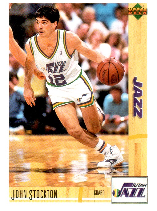
How do you feel about your drawing skills? Consider this quote from Michael Jordan: "I've missed more than 9,000 shots in my career. I've lost almost 300 games.
Twenty-six times, I've been trusted to take the game-winning shot and missed. I've failed over and over again in my life. And that is why I succeed."
What does Jordan's statement mean to you? Never give up. Keep trying. Even when you make mistakes, it will ultimately help you to succeed. Get your pencils and erasers ready - it's time to shoot some hoops!
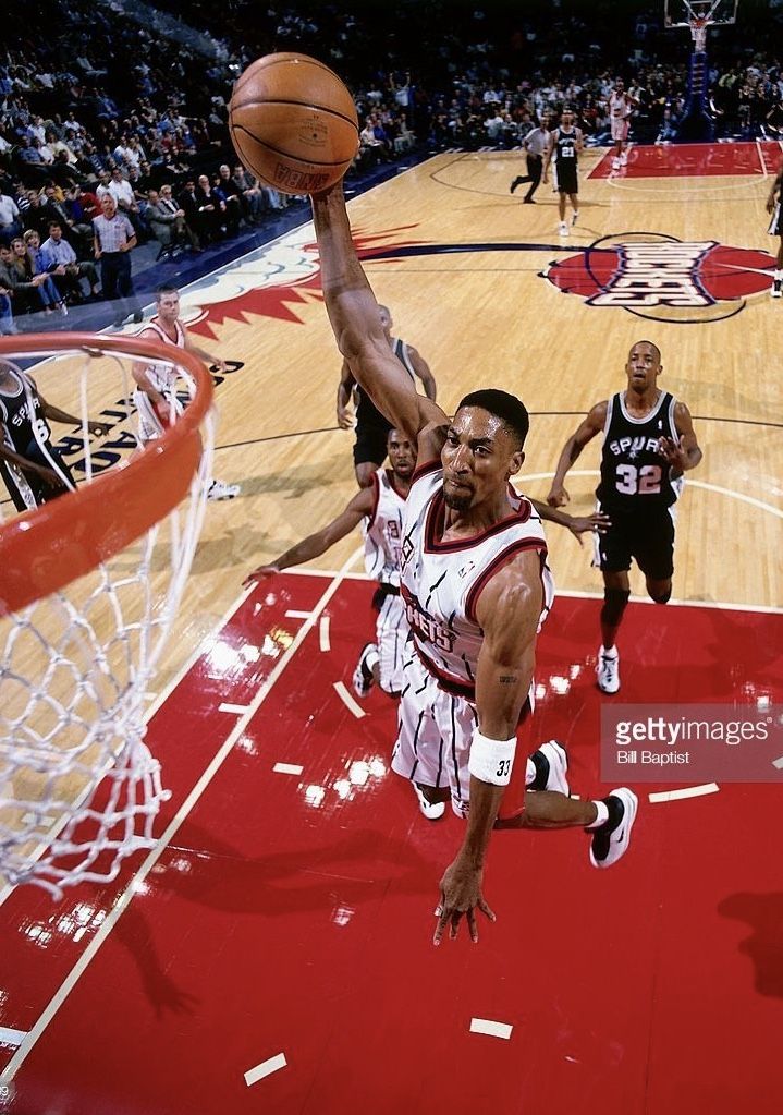
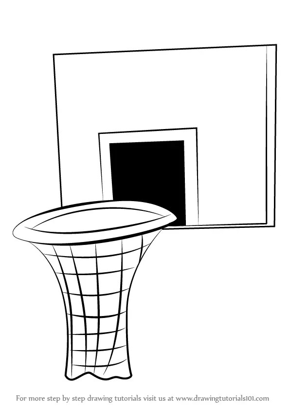
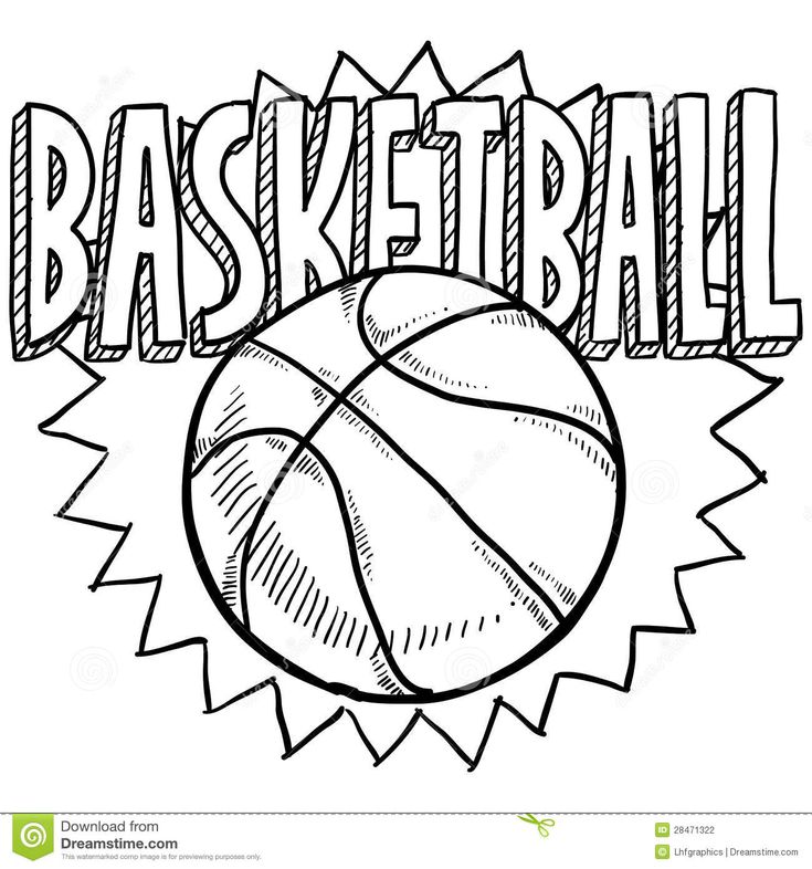
If you liked this tutorial, see also the following drawing guides: Basketball, Basketball Player, and Basketball Hoop.
Step-by-Step Instructions for Drawing the Chicago Bulls Logo
How to Draw a Great Looking Chicago Bulls Logo for Kids, Beginners, and Adults - Step 1
1. Begin by drawing the bull's nose. First, use curved lines to draw a rounded trapezoid. Then, draw a curved line across the bottom of the snout to form the mouth.
Easy Chicago Bulls Logo Drawing - Step 2
2. Draw a pair of curved lines upward from the snout to outline the sides of the nose. Draw ovals on the snout and shade them to form the nostrils. Draw a curved line at the corner of each nostril.
Easy Chicago Bulls Logo Drawing - Step 3
3. Connect the tops of the lines with a pair of curved "V" shaped lines that connect in a bent "W" shape. These are the bull's furrowed brows. Then, draw a wide "U" shaped line above the snout.
Easy Chicago Bulls Logo Drawing - Step 4
4. Draw a curved line upward from the snout on each side to form the sides of the face. The lines should reach toward the edges of the brows but not connect to them. Then, draw a series of curved lines - from the sides of the nose to the brows and sides of the face. These are the bull's eyes. Shade above the top line to indicate the pupils.
Easy Chicago Bulls Logo Drawing - Step 5
5. Draw a curved line from the side of the face on each side, and double it back upon itself. These are the ears. Then, draw a series of three curved lines across the center of the brows.
Easy Chicago Bulls Logo Drawing - Step 6
6. Use three curved lines to enclose the top of the head. The shape should be roughly quadrilateral.
Easy Chicago Bulls Logo Drawing - Step 7
7. Extend two curved lines, one from the corner of the head and the other from the top of the ear. Allow the lines to meet at a point, forming the horn.
Add More Details to Your Chicago Bulls Logo Picture - Step 8
8. Extend two curved lines from the opposite side of the head. Allow them to meet at a point to form the horn.
Complete the Outline of Your Chicago Bulls Logo Drawing - Step 9
9. Draw a curved "V" shaped line just below the tip of each horn.
Color Your Chicago Bulls Logo Drawing
Color your cartoon of the Chicago Bulls mascot. Typically, the face is red and the horns are white with red tips.
Easy, step by step Chicago Bulls Logo drawing tutorial
Click HERE to save the tutorial to Pinterest!
Chicago Bulls Logo Drawing Tutorial - Easy & Fun Printable Pages
MEMBER TROUBLESHOOTING
Still seeing ads or not being able to download the PDF?
First, check that you're logged in. You can log in on the member login page.
If you're still not able to download the PDF, the likely solution is to reload the page.
You can do this by clicking the browser reload button.
It is a circular arrow-shaped icon at the top of the browser window, typically found in the upper-left side (you can also use keyboard shortcuts: Ctrl+R on PC and Command+R on Mac).
Basketball Logos - Etsy.de
Etsy is no longer supporting older versions of your web browser in order to ensure that user data remains secure. Please update to the latest version.
Take full advantage of our site features by enabling JavaScript.
Find something memorable, join a community doing good.
(1,000+ relevant results)
Basketball court markings: standards and norms
Author of the article
Khvatkov Dmitry
Consultant in the production of rubber coatings
Basketball field marking requirements are approved by the FIBA standard. The site must be flat with a hard surface, free of bends, cracks and other obstacles. The accepted dimensions of the field are 28 m long and 16 m wide. By NBA standards, the field is slightly larger: 28.7 m (94' ft) long and 15.3 m (50' ft) wide.
Areas not intended for international competitions may differ from accepted standards (for public use, in schools or universities, etc.) and usually vary from 20 to 28 m in length and from 12 to 16 m in width.
Basketball Court Marking Standards
Basketball court markings are conventionally divided into 5 components:
Boundary lines. They are located along the perimeter of the site and set its size. The lines that run along the field are called side lines, and those that are behind the baskets are called front lines.
Central line. Divides the court in half parallel to the front lines.
Central zone. It is a circle and is placed in the middle of the center line, and, accordingly, in the center of the entire field.
Three-point line. It is a semi-ellipse and is located around the shields on both sides of the field. It limits the close range.
Free throw line. It is located in front of the boards parallel to the front line and is limited on the sides by paint lines.
The standard line width is 5 cm. All outlines and lines must be of the same color (usually white) and be clearly visible from anywhere on the court.
Common lines
Common lines are used to limit the playing area of the court. The side lines (along the field) according to FIBA standards should be 28 m long, and the front lines - 16 m. For public areas, deviations from the accepted standards are allowed. Typically, basketball courts in schools or gyms are made from 20 m long and 12 m wide.
Central lines
The center line is parallel to the front and divides the field exactly in half. According to the standards - it should extend beyond the side lines by 15 cm on both sides.
In the middle of the center line there is a circle with a diameter of 3.6 m, which limits the central zone of the field. In this zone, the ball is played at the beginning of the game.
Three-Point Line
Three-Point Lines are located around the backboards on both sides of the field and consist of two straight lines 2.9 long9 m and a semicircle. Straight lines run perpendicular to the front at a distance of 0.9 m from the side lines. Despite the fact that visually the distance from the ring to the side of the three-point line seems to be less than to its central part, the distance from the backboard to any point is 6.75 m.
Penalty lines
Penalty lines limit the nearest area at the backboard. They consist of a trapezoid and a free throw zone.
Despite the name, the "trapezium" is a rectangle (until 2009year it really was a trapezoid), which is located under the shield. Its dimensions are 5.8 meters long and 4.9 meters wide. The shield is located at a distance of 1. 575 m from the end line in the middle of the court. In front of the backboard, at a distance of 1.25 m, there is a semicircle that limits the area for picking up the ball.
At a distance of 4.225 meters from the backboard, the trapeze zone ends and the free throw zone begins. It is a semicircle with a diameter of 3.6 m (like the central circle).
Paint zone lines
These lines are serifs on both sides of the trapezoid (parallel to the sidelines). They limit the areas for players who are fighting for the ball during a free throw.
Zones on the basketball field
The basketball court is divided into zones using markings. Each zone has its own specific rules.
Center circle
The center circle is used as a separate kick-off area at the start of the game. One representative from each team stand in a circle from their side and fight for the ball in a jump, after it is dropped by the referee. All players are exclusively on their side of the field, except for one who rebounds on the opponent's side.
Neutral zone
The peculiarity of this zone is that as soon as the player of the attacking team with the ball crosses the center line and is on the side of the opponent, he cannot pass the ball to the player of his team who is on the other side of the field (i.e. behind center line on your side).
Three-point zone
The three-point line limits the near zone of the shot. Hitting the basket from outside the basket brings the team three points. If the throw was made inside the zone, then it brings two points.
Three-second zone
This is the zone in close proximity to the ring. It is called three-second, since the player of the attacking team cannot be in it for more than three seconds. Most balls are thrown in this zone, so when attacking, it provides maximum protection.
Free throw area
In controversial situations, a free throw is provided from this area. The player of the attacking team must score the ball without stepping over the line of the trapezoid. At the same time, the players of both teams are not in the three-second zone. They take up positions along the paint lines on the sides of the trapezoid and may not step outside the lines until the free throw shooter has shot the ball.
How to mark a basketball field?
Basketball field markings, whether it is an international competition court or an open-air amateur field, are best applied using special equipment. This will ensure the long life of the coating, the lines will not clog and will promote fair play.
You can order the marking of a basketball court in Moscow and the Moscow region from Rezkom. We will measure the premises and develop a design project for the field so that it complies with generally accepted rules and is convenient for operation. For more details, you can contact our manager by phone 8-495-64-24-111.
How to create a sports team logo and why you need it
Dmytro Leiba
Updated by
Loading. ..
Contents : 1.Why does your sports team need a logo? 2.How to make a sports team logo 3.Ready to create a logo for your sports team?
What fan doesn't recognize the logo of their favorite sports team and the colors of their players? The logo and colors are the two main elements that make up the unique style of the team.
But the situation with a logo is much more complicated than with flowers. Designing a really good logo for a sports team isn't easy, especially if you're not a professional designer.
Where to start?
We have prepared a step-by-step instruction for you to create a logo for a sports team. By combining these steps with your own techniques and techniques, you can create a logo creation sequence that is right for you.
First, we'll talk about why you need a logo and how it can help your team. Then we will look at the sequential steps of creating a logo. Well, are you ready to get started? Then let's start!
Why does your sports team need a logo?
Before you start creating your logo, you need to answer one important question: why does your sports team or clan need their own logo? And is it needed at all? Maybe this is another marketing ploy? Isn't the team name enough?
But it turns out that the logo of a sports team is not just another "trifle" that plays only a decorative role. The logo performs a number of important functions.
The logo identifies your team
The logo is not just a picture that is displayed next to the team name in the standings and applied to souvenirs. This is an important element that forms the image of the team in the eyes of the players, club members and fans. No matter what team you have - football, hockey, esports team in CS, Dota or tanks, the logo will help your promotion.
Like a national flag, a good emblem can evoke strong emotions and associations. It gives people a sense of belonging, strengthens team spirit and cultivates an atmosphere of mutual support. Not too few features for a small icon, right?
The logo gives your team a more professional look
The emblem not only sets the mood within the team, but also influences how other people perceive you. A well-designed logo indicates that you are dedicated to your team and take what you do seriously. And it's true: every professional team has its own unique emblem.
Even if you don't play in professional leagues, a good logo can present you as a serious player to be reckoned with. This is necessary both to create an appropriate reputation among opponents and to attract sponsors.
The logo makes your team more recognizable and memorable
Have you noticed that even while traveling, you will at least once, but definitely look into some popular fast food restaurant? This is because fast food companies have invested huge amounts of money in developing and implementing a marketing strategy that has made them recognizable around the world.
Now think about your favorite fast food restaurant. We bet you thought about the logo of this company! A sports logo works in a similar way: it makes your team more recognizable and helps you stand out from your opponents. And this, in turn, increases your chances of being accepted into a prestigious club or finding a worthy sponsor.
Well, have we convinced you? Then let's move on to the most interesting.
How to make a sports team logo in 10 steps
So, we have answered the question "Why?". Now we will try to answer the question “How?” in as much detail as possible.
1. Brainstorm
First, you need to form a general idea of how you see your future logo. What do you want to communicate with your logo? We already wrote that the logo identifies your sports team, forming its unique style? Now it's time to think about your team's unique style. So what message are you trying to communicate with your logo? What values do you want to convey? By answering these questions, you will immediately understand in which direction you should move forward.
It's also good to think about what characterizes your team. This could be the name, nicknames of the players, home court, and other things that your team is associated with. Animals can also be used in sports logos, such as a lion, bear, horse, dog or cat.
2. Explore the logos of other teams
It is equally important to identify specific emblems that serve as a guide and source of inspiration for you. Fortunately, in the age of the Internet, this is very easy. All you have to do is open Google and type in the query “team logos for [your sport name]”. For example, logos of football or hockey teams. Also check out the dedicated logo design websites:
Logo Gala
Logo Moose
LogoLounge
Dribble
DeviantArt
Search functionality is available on these sites. Enter “football logo”, “sports team logo”, “hockey”, “basketball” and other similar queries into the search box.
After rethinking the design solutions you see, you will surely come up with several ideas of your own that will be no worse (or even better) than your prototypes.
To more clearly outline the concept of your future emblem, answer the following questions:
Which of the options you see do you like and what ideas would you like to adopt?
How can these options be improved and stand out from the crowd?
Which elements would you like to use and which would you rather stay away from?
Keep looking through the emblems until you have a clear idea of what logo you want to create for your team. Then you will be ready to move on to the next step.
There's nothing wrong with looking to other designers for inspiration. However, do not mindlessly copy other people's work. If the logo of your opponents shows a shark, tiger or fish, you should not add something like that to your logo. This defeats the purpose of creating a unique style for your team.
We have also collected some examples of interesting team and club logos. You can find more logo examples here.
3. Pay attention to the different types of emblems
Looking at the work of other teams, you will see that there are several types of emblems. While some logos are abstract images or symbols, others are represented by a text element. But often sports logos combine both a graphic element and text.
Graphic-only logos are more commonly used by commercial companies that invest a lot of time and money into creating a corporate identity. But if your emblem consists only of the name of your team, it is unlikely to evoke certain associations and emotions.
Therefore, it is better to follow the example of the majority and include different elements in your logo. But if you have a really good idea that is radically different from the options you've seen, be sure to give it a try.
4. Learn the fonts used by other sports teams
While we're talking about logo elements, let's take a closer look at fonts. The font is a very important part of any emblem. The world of fonts is vast and diverse. By exploring this topic in more detail, you will discover a lot of new and useful information that will help you create the perfect option.
We suggest you take a look at the following collections of fonts that are used in sports emblems:
Fonts-online
1001 Fonts
FontSpace many interesting options. You can also find a selection of good logo fonts here.
Don't want to use existing fonts? Then design your own font like many professional teams do:
Do not try to create a frilly, deliberately catchy typeface. Among the already existing fonts, you can also find a decent option that will become the basis for a unique logo. The choice of font (as, indeed, any element of the emblem) depends on your preferences and goals.
5. Sketch
Do you already have some ideas? Then it's time to pick up a pencil. Lack of ability in drawing is not a hindrance in the way of creating a logo. Your goal is not to immediately present the finished drawing, but to bring your first ideas to life.
In addition, now there are many services where you can create a logo in a few minutes. Logaster is one of the best services for this. It is enough to enter the name of the team, and the program will generate a lot of logos. You can also search for icons by keywords, for example: star, crown, wings, ball, etc.
Forget self-censorship. Create as many variations of the logo as you see fit (even if they all look very similar to each other). At this stage, the main thing is quantity. You can focus on quality later.
Do not be afraid to experiment and fantasize. You will see, as a result of your creative searches, something interesting will surely turn out! And one more tip: focus on form, not color.
First, you will most likely use the colors of your team as your logo colors. Therefore, it is not worth spending time and energy on thinking through the color scheme.
And, secondly, a truly high-quality logo should perform its functions not only in color, but also in black and white. Remember that your logo needs to look good across platforms and media, from large color posters to fuzzy monochrome faxes. Therefore, at this stage, the color palette fades into the background.
6. Narrow down the list of options
By this stage you should already have a more or less clear idea of what you want and have prepared several possible options for your future emblem.
Now it's time to reduce the number of sketches, leaving the most viable ones. To select the top few options, rate each thumbnail based on the following criteria:
Relevance - Is the logo telling the audience what it needs? By looking at it, people can determine what kind of sport you do?
Simplicity - Does the logo look too complex and confusing?
Originality - Does your emblem look like another team's logo? Is it easy to remember?
Easy to read - Is your logo easy to understand and interpret?
Relevance - Will your logo remain recognizable over the years?
As you can see, the signs of a good emblem are listed above. Using these criteria will help you find really worthy options among the many ideas.
And don't forget to listen to your intuition. Sometimes we gravitate towards some ideas more than others. And often there are quite definite reasons for that, though not always clear to us.
If possible, reduce the number of options to three sketches.
7. Take a break and ask others for their opinion
If you don't know where to go next, take a break and refrain from making spontaneous decisions. Creating a logo is a process that takes time. By taking a break from work, you can put your thoughts in order and look at the situation from the outside. Often the best ideas come to mind when you put no effort into it!
Do not neglect other people's opinions. Your colleagues can give you interesting ideas and point out mistakes that you yourself would not notice. Moreover, the joint work on the creation of the logo favorably affects the cohesion of the team. By suggesting ideas and voting on their favorite options, team members get to know each other better and build trust.
8. Choose the best option
Now it's time to make a final decision and settle on one sketch. If you see that none of the proposed options are suitable, try starting from scratch.
Having chosen the best sketch, feel free to start working on smaller details. At this stage, it is important to determine which elements of the emblem can be removed without losing the meaning and emotional load. The more concise the logo, the easier it is to remember and reproduce on various media.
9. Customize the logo
As already mentioned, your team's logo makes itself known to the outside world. You don't want your badge to say, with its casual, unprofessional look, to people, "We don't like to see things through" do you?
If you created a logo using an online service, then everything is simple. Choose the final arrangement of elements, color and download it. If not, find a professional designer who you can trust to create a logo based on your sketches. He will help you refine your idea and remove all unnecessary. It will also digitally create your logo so you can easily use it for various purposes. But the services of a professional designer are not cheap, this must be taken into account.
10. Start using your new logo
Congratulations! You have done a great job creating the most important element of your sports team's style! But it's too early to rest. Now you have a new challenge: to properly manage your new logo.
Print the logo on solid media (t-shirts and sweaters, stationery, etc.) and post it on your team's official website and email form.
Ready to create a logo for your sports team?
A logo is the first thing people think of when they mention a sports team or club. By creating your own logo, you shape the unique style of your team and make it more recognizable among fans, opponents and sponsors.


 Begin by drawing the bull's nose. First, use curved lines to draw a rounded trapezoid. Then, draw a curved line across the bottom of the snout to form the mouth.
 Shade above the top line to indicate the pupils.
 Typically, the face is red and the horns are white with red tips.
 The site must be flat with a hard surface, free of bends, cracks and other obstacles. The accepted dimensions of the field are 28 m long and 16 m wide. By NBA standards, the field is slightly larger: 28.7 m (94' ft) long and 15.3 m (50' ft) wide.

 575 m from the end line in the middle of the court. In front of the backboard, at a distance of 1.25 m, there is a semicircle that limits the area for picking up the ball.
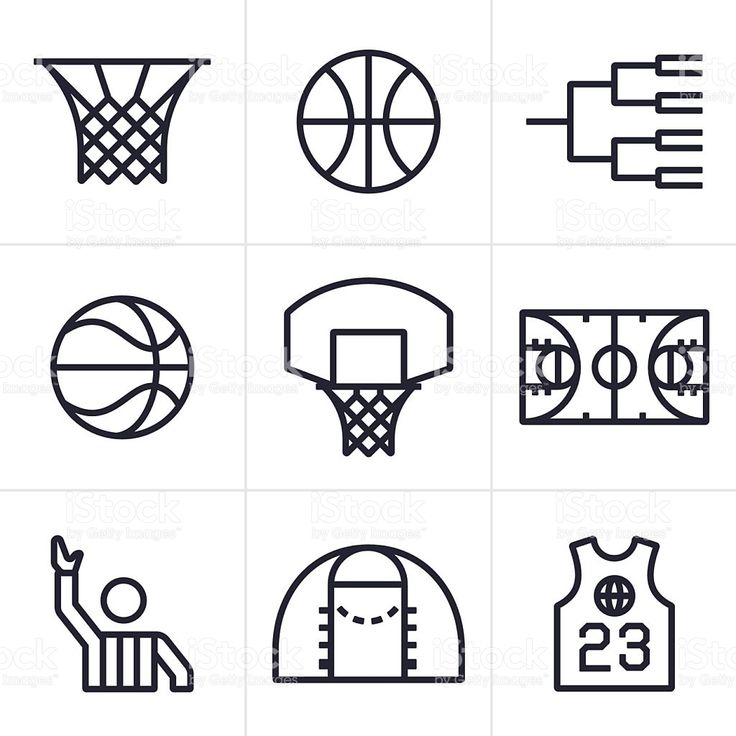
 At the same time, the players of both teams are not in the three-second zone. They take up positions along the paint lines on the sides of the trapezoid and may not step outside the lines until the free throw shooter has shot the ball.
  ..
..  The logo performs a number of important functions.
  A well-designed logo indicates that you are dedicated to your team and take what you do seriously. And it's true: every professional team has its own unique emblem.
  And this, in turn, increases your chances of being accepted into a prestigious club or finding a worthy sponsor.
  Animals can also be used in sports logos, such as a lion, bear, horse, dog or cat.
 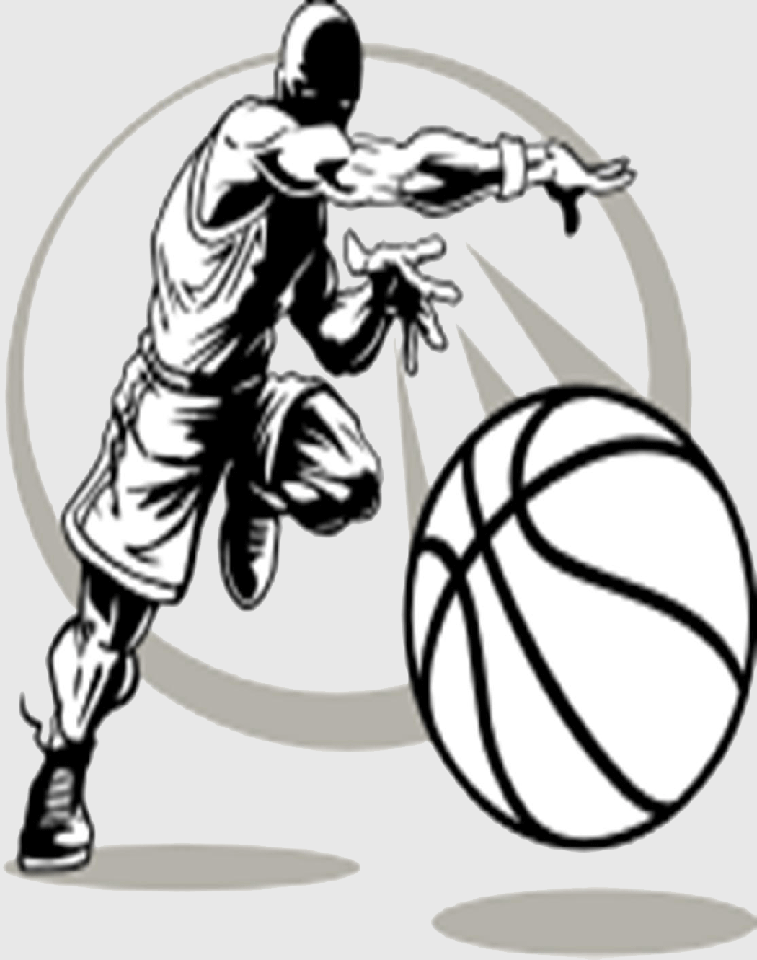 Then you will be ready to move on to the next step.
 Among the already existing fonts, you can also find a decent option that will become the basis for a unique logo. The choice of font (as, indeed, any element of the emblem) depends on your preferences and goals.
 Using these criteria will help you find really worthy options among the many ideas.
  By suggesting ideas and voting on their favorite options, team members get to know each other better and build trust.
  If not, find a professional designer who you can trust to create a logo based on your sketches. He will help you refine your idea and remove all unnecessary. It will also digitally create your logo so you can easily use it for various purposes. But the services of a professional designer are not cheap, this must be taken into account.